Overview
The
challenge
Personal safety in urban environments is a daily concern for many — particularly women. Existing tools like messaging apps or general navigation apps were never designed with this specific need in mind, leaving a real gap: how do you move through a city and feel genuinely accompanied and protected?
The challenge was to design a digital solution — a mobile app — targeted at women with the aim of improving their experience living and moving around the city, while also facilitating the sharing of safety information about public spaces with other users.
I used the Double Diamond Design Thinking Method by the Design Council as my framework: gathering information through desk research, surveys and interviews, then defining, ideating, and delivering a complete high-fidelity prototype.
Research Phase
Discover
& Define
Survey of 30 women aged 16–37 from Argentina, Chile, Venezuela, and Spain. 16 questions covering daily safety levels, past incidents, behavior changes, and device and app usage habits.
5 in-depth user interviews with women aged 18–39 about their experiences walking in the city and the safety habits they practice when going out alone.
Competitive benchmark analyzing 6 direct and indirect competitors — Sister, UpGirl, Sosafe, WhatsApp, Telegram, and Uber — to identify feature gaps Siemap could uniquely address.
Research Synthesis
Key
insights
After surveys, interviews, an empathy map, and clustering sessions, three core insights shaped the entire design direction of Siemap.
Solidarity is a strength
Women showed a remarkable willingness to help others in situations of harassment or risk. A greater facility for empathy and mutual understanding between them is a real behavioral pattern to design around.
Location sharing is essential
Sharing real-time geolocation or a travel itinerary with trusted contacts were the most highly valued safety features. Users were already doing this manually — the app needed to make it seamless.
Reporting needs safety
Fear of being judged or the lack of a safe, anonymous space to express themselves freely are the main reasons women avoid making public complaints about harassment incidents.
Define Phase
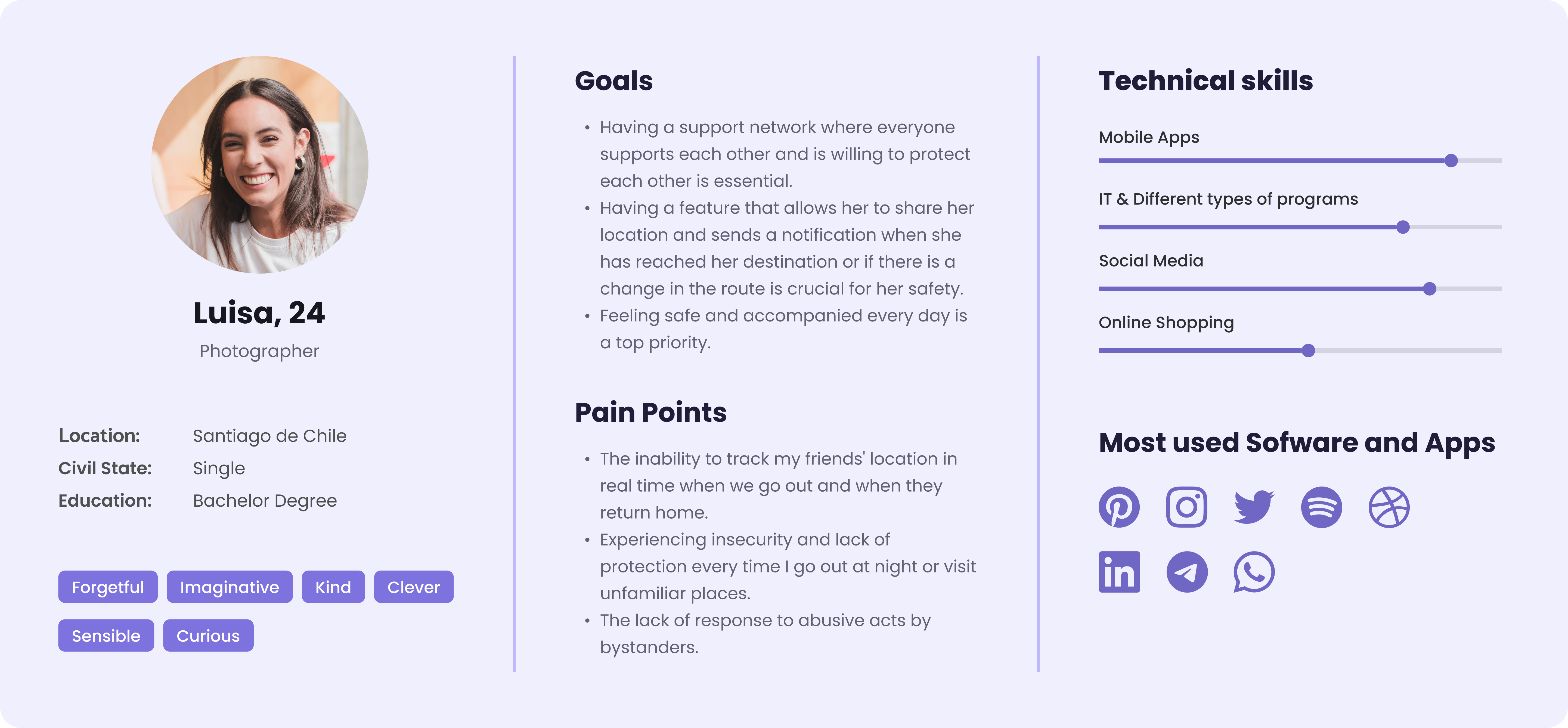
User
Persona
After gathering data, I created a persona to embody the primary user group. Luisa, 24, is a photographer in Santiago de Chile — imaginative, curious, sensible. She navigates the city daily and worries about her safety when going out at night or visiting unfamiliar places.
Define Phase
User
Journey
Mapping Luisa's journey as she encounters situations where she needs to move safely through the city revealed key pain points and design opportunities across three stages: before leaving, on the way, and returning home.
.png)
Design Challenges
How Might We...?
HMW ensure Luisa can share her location with multiple friends at once without switching between apps?
HMW give users meaningful route options that account for both safety level and travel time — not just speed?
HMW create an emergency mode that can be activated instantly, discreetly, and with zero friction?
Ideation Phase
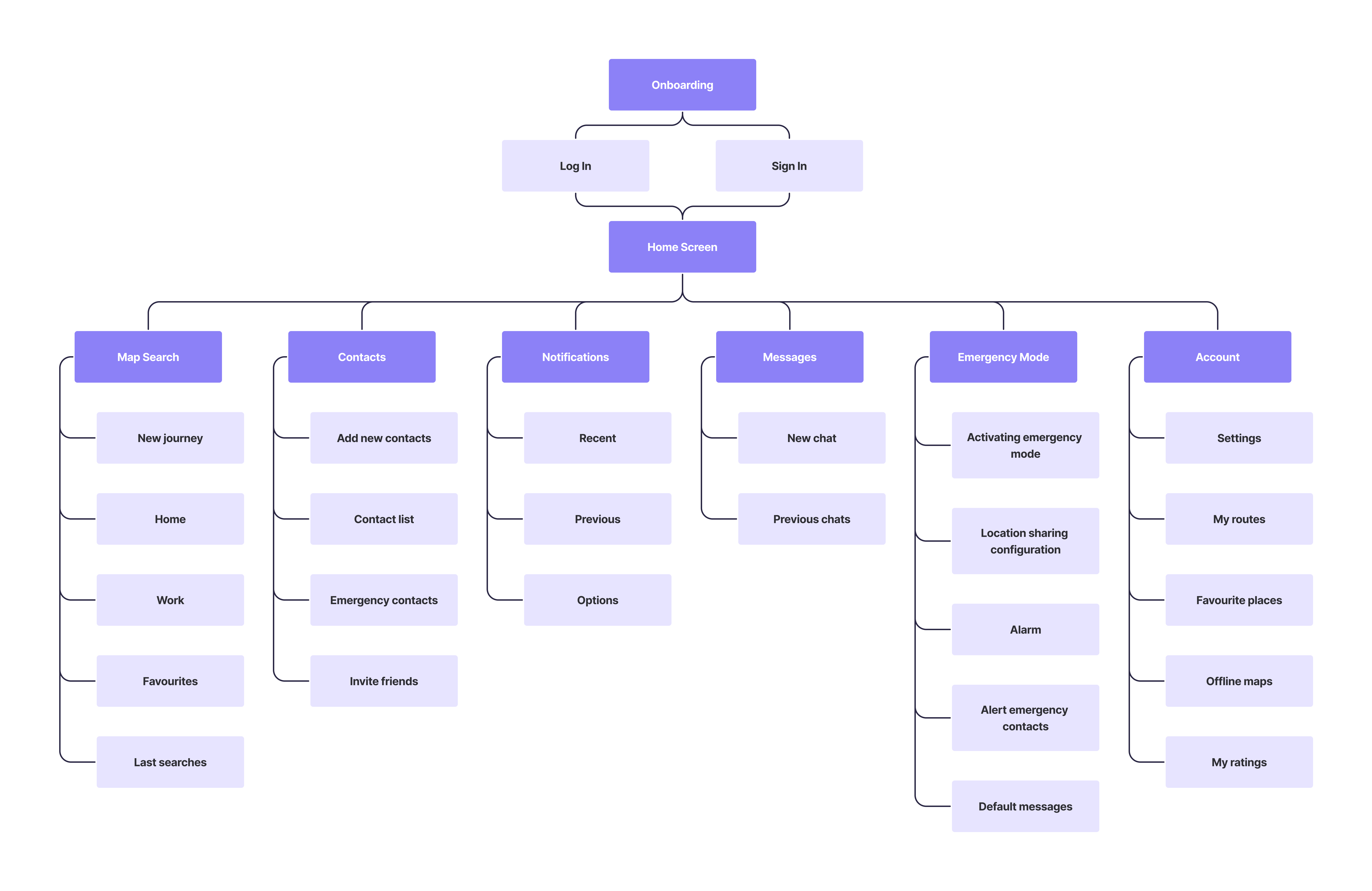
Information
Architecture
The sitemap was developed in accordance with the project's objectives and specific requirements — visually representing the content hierarchy and ensuring all essential features were accounted for before wireframing began.
Ideation Phase
User
Flows
Two user flows were designed. The primary flow covers creating a shared journey. The secondary flow covers sign-up/log-in and adding emergency contacts.
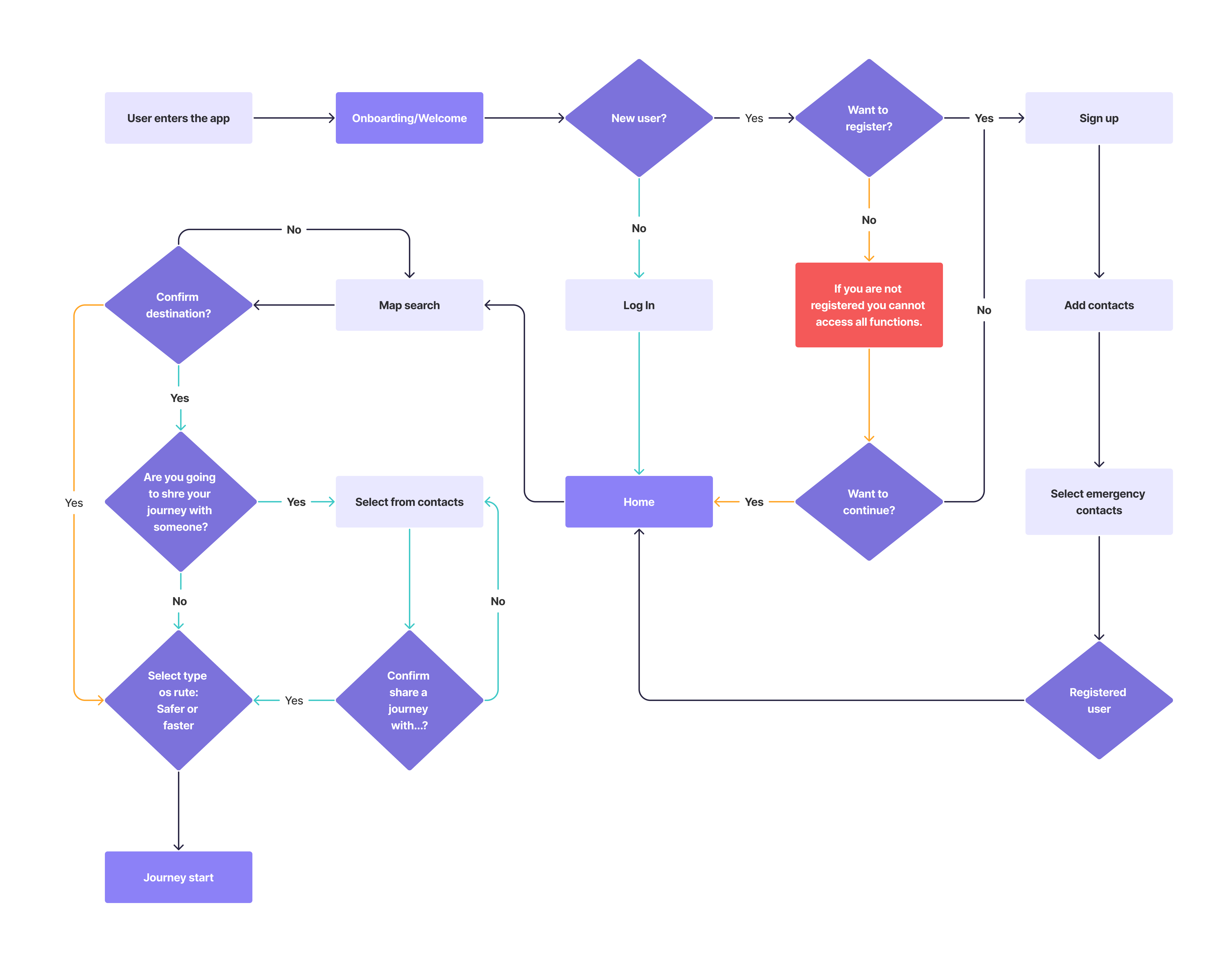
Main flow — shared journey
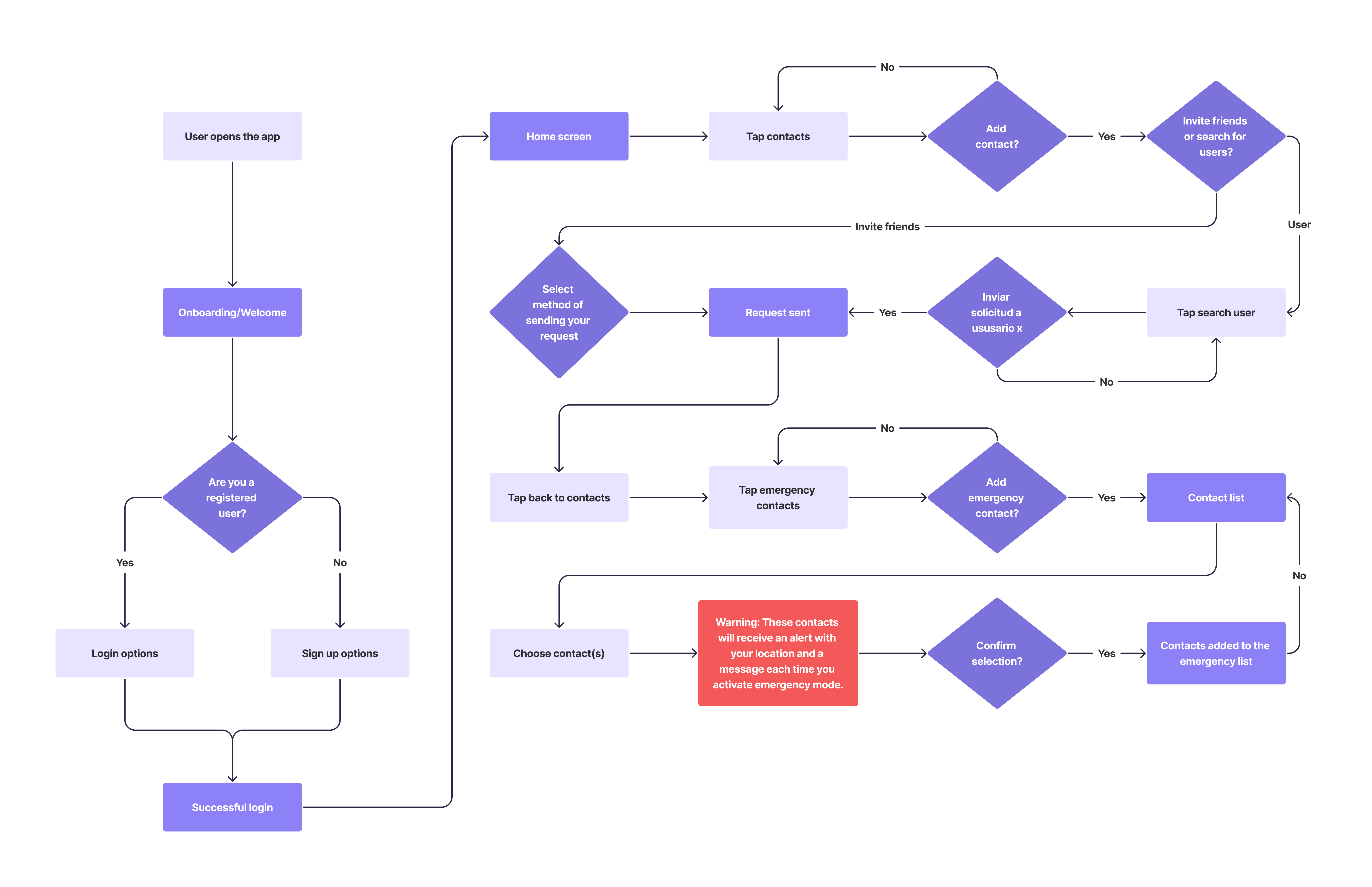
Secondary flow — sign up & contacts
Design Process
How I
built it
Following the Double Diamond methodology, I moved from broad discovery to a focused, validated solution — covering all phases of UX: research, synthesis, ideation, design, and testing.
Discover
Desk research, surveys and interviews to deeply understand the challenge. 30 survey responses and 5 user interviews gave me direct access to real fears, habits, and needs.
Define
Empathy mapping, clustering, and user personas to synthesize research into actionable insights. The user journey made key design opportunities concrete and visible.
Develop
Sitemap, user flows, wireframes, and a full design system — including logo, color palette, typography, and UI kit — built from scratch in Figma.
Deliver
13 usability tests across both mid-fi and hi-fi prototypes. Findings iterated directly — clearer route flow and a first-time onboarding tutorial added.
Design System
Visual
language
Siemap's identity was built to feel safe, trustworthy, and calm — without being cold. Purple was the natural anchor: associated with empathy and has a strong connection with the feminist community. The name itself: "Sie" (German for "She," "They," "You") + "Map" — a reference to the core function. The logo symbol combines a location pin with the letters S and M.
Color Palette
Brand
Base
Semantics
Typography

Logo
Design Phase
Mid-Fi
Wireframes
Mid-fidelity wireframes in Figma let me focus on visual hierarchy and coherence before applying styles. I incorporated established design patterns from similar map applications.
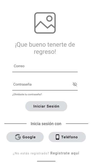
Log In
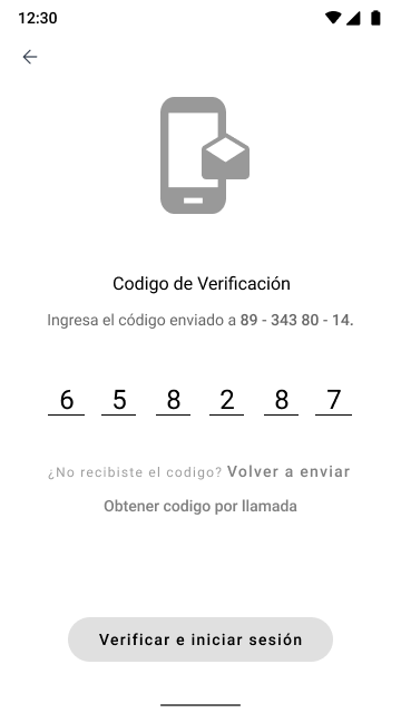
Verification
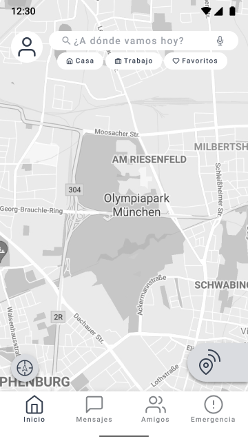
Home / Map
Route Options
Travel Overview
Emergency Mode
Messages
Design Phase
High-Fi
Prototype
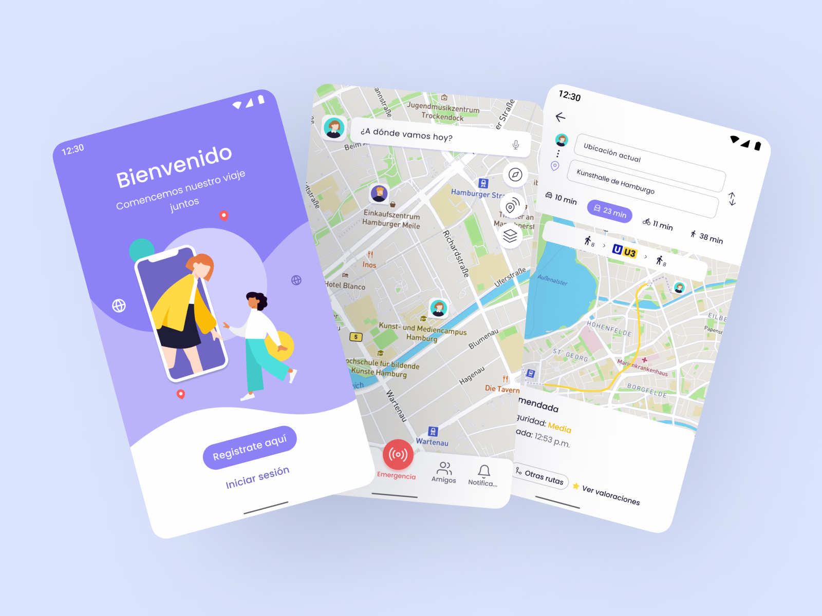
High-fidelity wireframes guided by the established design system. Once screens were linked together, the prototype was ready for usability testing.
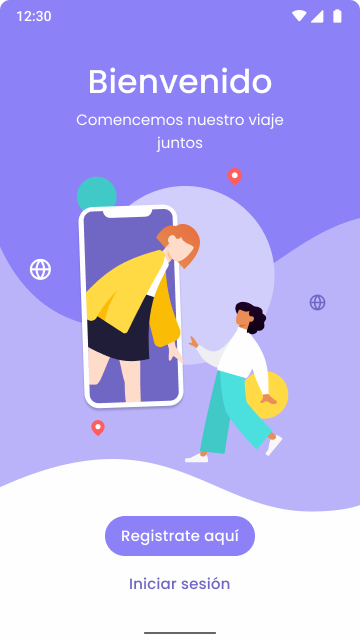
Onboarding
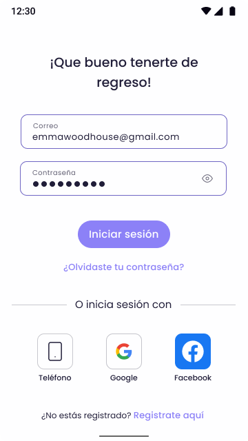
Log In
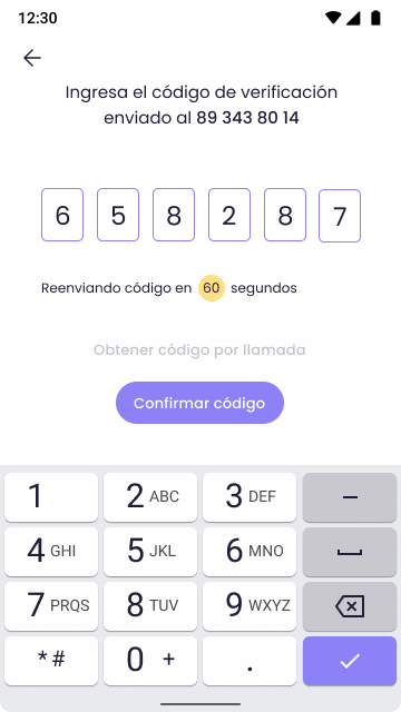
Verification
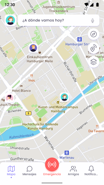
Home / Map
Route Selection
Active Route
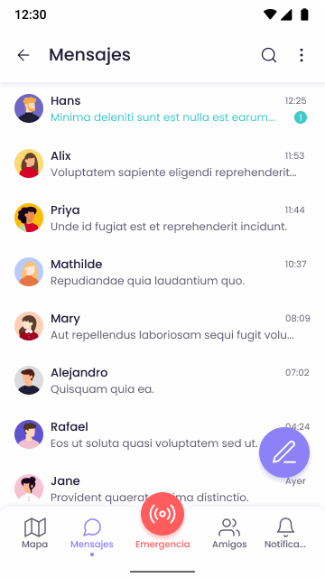
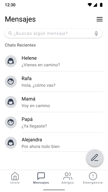
Messages
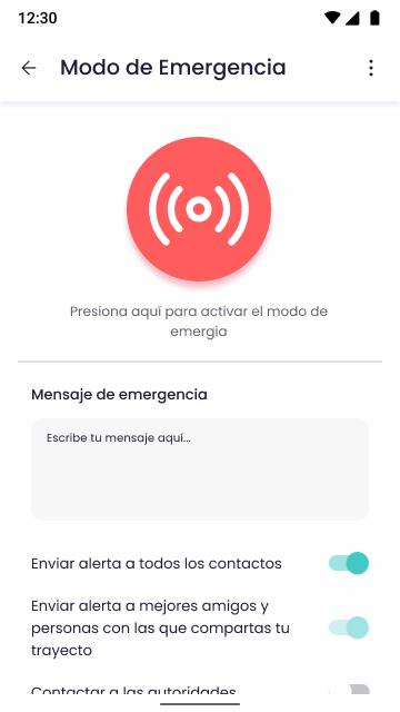
Emergency Mode
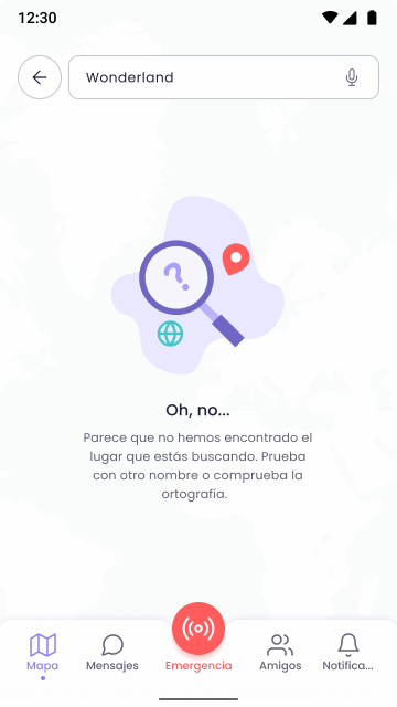
Empty States
The App
What I
designed
Siemap brings together safe routing, location sharing, and an emergency system into a single, intuitive mobile app.
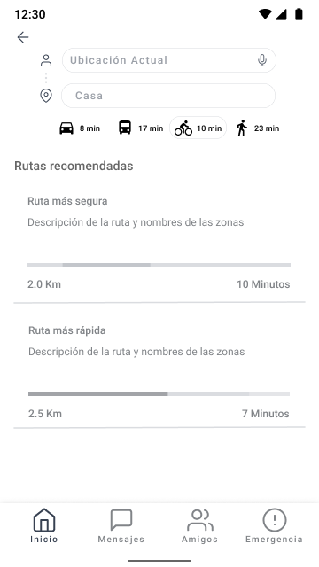
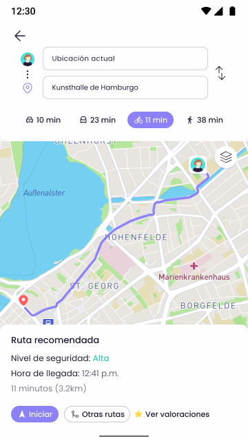
Safe Route Options
Users can choose between "safer route" or "fastest route" options, each evaluated by safety level and estimated travel time. Routes are color-coded to help users make informed decisions before they leave home.
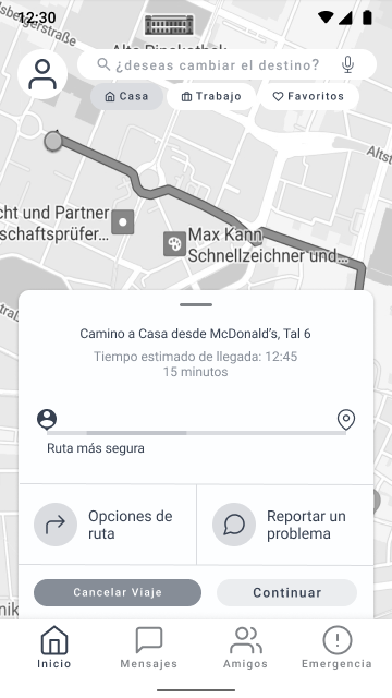
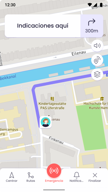
Shared Journeys
Users can create a journey and share it with multiple contacts simultaneously — no need to send individual location pings via other apps. Friends can follow along and are notified when you arrive safely.
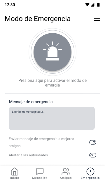
Emergency Mode
A dedicated emergency screen lets users instantly notify trusted contacts and authorities with a pre-set message. Different alert types can be toggled — all in one tap, designed for high-stress situations.
Zone Safety Map
The map displays community-contributed, color-coded risk levels for different city areas. This gives pedestrians real-time contextual awareness before and during their routes — the community itself becomes a safety resource.
Usability Testing
13 tests.
Real findings.
A total of 13 tests were run — 8 with the lo-fi prototype and 5 with the hi-fi. All participants matched the Luisa persona profile for realistic, relevant feedback.
Route start was unclear
Several users couldn't tell at what point the journey had actually started. The in-process screen was redesigned with clear visual indicators and turn-by-turn instructions visible throughout the trip.
App functions confused first-timers
Some unique Siemap features — like the shared journey flow — weren't intuitive on first use. A mini-tutorial onboarding was added, shown once to new users at registration.
Core tasks completed successfully
All three primary tasks — logging in, adding emergency contacts, and creating a shared journey — were completed successfully after iteration, validating the core design decisions.
Outcomes & Reflection
What this
project taught me
Siemap was my first complete end-to-end UX project, and it challenged me to think deeply about designing for emotional needs, not just functional ones. Safety isn't just a feature — it's a feeling. Getting the interface to communicate trust, calm, and competence required constant attention to detail: the weight of a button, the color of a zone, the wording of an emergency message.
The research phase was transformative. Sitting with data from 30 women and 5 interviews made me understand something I couldn't have learned from a textbook: the design problem wasn't just technical, it was social. The solution had to honor both the individual's experience and the collective power of a community. That realization shaped everything that followed — from the user flows to the brand name itself.